Marketing Tips
We've tucked away the header (Menu) on this post so you can focus without distractions! Visit the homepage.
Crafted by your favourite crustacean
This post was crafted in the tone and style of our mascot, Markskrill.
G'day, mates! Let's talk about text. It's the difference between a snag on the barbie and a shrimp on the barbie. One stands out, the other... not so much. If your text blends into the background, it's like hiding the beer at a backyard gathering – no one's gonna be happy, and no one's gonna see it.
So, how do you make your text pop? It’s all about making sure your words are seen clearly, no squinting required. This is vital for your website, emails, and any digital content where you want to grab attention.
Why text legibility is a game-changer
Getting your text legibility right isn't just about looking pretty; it's about making your content actually work.
- Readability: High legibility ensures your text is super easy to read, no matter the device or screen. No one wants to strain their eyes.
- User Experience (UX): When text is hard to decipher, it frustrates visitors. Good legibility means a smooth, enjoyable experience, keeping folks on your page longer.
- Accessibility: Crucially, strong legibility makes your content accessible to everyone, including people with visual impairments. It’s about not leaving anyone behind.
- Brand Professionalism: Clear, legible text reflects attention to detail and professionalism. It shows your business cares about its presentation and its audience.
Putting best practices to work
So, how do you ensure your words stand out like a lighthouse in a storm?
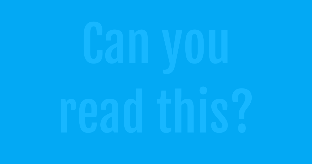
- Go for high contrast: The golden rule is light text on a dark background, or dark text on a light background. Think classic black text on a white page, or crisp white on a deep blue. It’s like wearing a bright shirt to a dark party – you'll stand out.
- Mind the size: Don't forget about font size! Small text is like trying to read a tiny menu in a dimly lit pub. No one wants to squint that much. Make your text big enough to be seen easily.
- Weight for impact: Use bolding strategically for emphasis. Heavy text against a lighter background can draw the eye to key points without overdoing it.
- Test it out: Always view your content on different devices and screen brightness settings. What looks good on your big monitor might be a nightmare on a phone in bright sunlight.
Prioritising text legibility is a simple but powerful way to ensure your website and digital content is effective, user-friendly, and professional. It's about making sure your message always hits the mark.
References
As a commercial entity focused on providing engaging and accessible content, we generally do not include formal citations, references, or lists of sources. However, there may be instances where we directly quote or significantly draw upon the work of others, in which case we will always provide appropriate credit where it is due.
Flashcards
Welcome to your interactive marketing glossary. Understanding the language of modern marketing jargon is crucial for success, and this tool is designed to help you master the essential terminology, from A/B testing to SEO. Begin by studying the terms in our flashcard deck.
Click card to flip
Which term matches this definition?
There are more words to learn!
Join our exclusive marketing newsletter
Psst! Hey, you! Yeah, you! Wanna be part of something exclusive? Sign up for a free Business Hub account and you'll get access to your own marketing software, packed with built-in features! On top of that, we'll invite you to our webinars, where we share insider knowledge on topics that we might not discuss here.

