Marketing Tips
We've tucked away the header (Menu) on this post so you can focus without distractions! Visit the homepage.
Crafted by your favourite crustacean
This post was crafted in the tone and style of our mascot, Markskrill.
G'day, legends! Ever picked up a newspaper and instantly scanned the top half for the headlines? There's a reason for that. This old-school principle, often called the "newspaper fold," is still dead set crucial in the fast-paced world of modern websites.
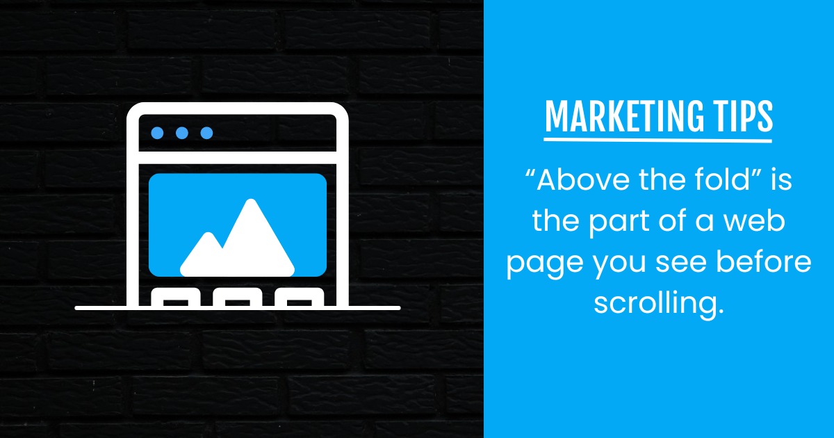
It's about how you present your digital front page – that precious bit of your site people see before they even think about scrolling.
Understanding this "fold" isn't about some rigid line on your screen; it's about the prime real estate visible on a visitor's screen as soon as your page loads. It’s your first impression, and you only get one shot to make it count.
What's the go with the 'digital fold'?
Back in the day, the "fold" was the physical crease in a newspaper. Anything above it was visible without unfolding. On a website, the concept is similar: it's everything a visitor sees on their screen without needing to scroll down.
Now, because everyone's using different devices – big monitors, tiny phones, tablets – that "fold" isn't a fixed line. It changes! But the principle remains the same: the content above this invisible line is your golden opportunity to grab attention immediately.
Why this old dog still has tricks
Despite varying screen sizes, the area above the fold remains king for a few ripper reasons:
- Instant impact: It's your first impression, your chance to hook visitors in the blink of an eye. You want to tell them exactly what you're about and why they should stick around.
- Crucial information: This is where your most important messages, calls to action, and engaging visuals should live. Don't make visitors hunt for the good stuff.
- User expectations: People are impatient. They expect to find what they're looking for, or at least a compelling reason to stay, immediately.
- Attention spans: With digital attention spans shorter than a kookaburra's laugh, you've got precious seconds to make a connection.
Mastering your digital front page
So, how do you make the most of this prime digital real estate?
- Prioritise content ruthlessly: What's the single most important message or action you want a visitor to take or understand immediately? Put that front and centre.
- Clear value proposition: Make it crystal clear what problem you solve or what benefit you offer, right at the top.
- Engaging visuals: Use high-quality imagery or video that quickly conveys your message and draws the eye.
- Strategic calls to action: If you want someone to do something (like sign up or learn more), make your primary call to action visible above the fold.
- Design for mobile first: Always consider how your "digital front page" looks on a small phone screen. If it works there, it'll likely work anywhere.
Understanding and strategically utilising the "digital fold" remains a timeless, vital principle for effective web design. It ensures your key messages hit home from the get-go, turning fleeting glances into genuine engagement.
References
As a commercial entity focused on providing engaging and accessible content, we generally do not include formal citations, references, or lists of sources. However, there may be instances where we directly quote or significantly draw upon the work of others, in which case we will always provide appropriate credit where it is due.
Flashcards
Welcome to your interactive marketing glossary. Understanding the language of modern marketing jargon is crucial for success, and this tool is designed to help you master the essential terminology, from A/B testing to SEO. Begin by studying the terms in our flashcard deck.
Click card to flip
Which term matches this definition?
There are more words to learn!
Join our exclusive marketing newsletter
Psst! Hey, you! Yeah, you! Wanna be part of something exclusive? Sign up for a free Business Hub account and you'll get access to your own marketing software, packed with built-in features! On top of that, we'll invite you to our webinars, where we share insider knowledge on topics that we might not discuss here.

Markskrill
G'day, I'm Markskrill, the friendly face of Marksy.com.au! A mischievous Australian krill with a passion for all things digital marketing. I'm here to guide you through the terrifying world of business, using a playful tone and simplified concepts.